A tricky conception. A miraculous result
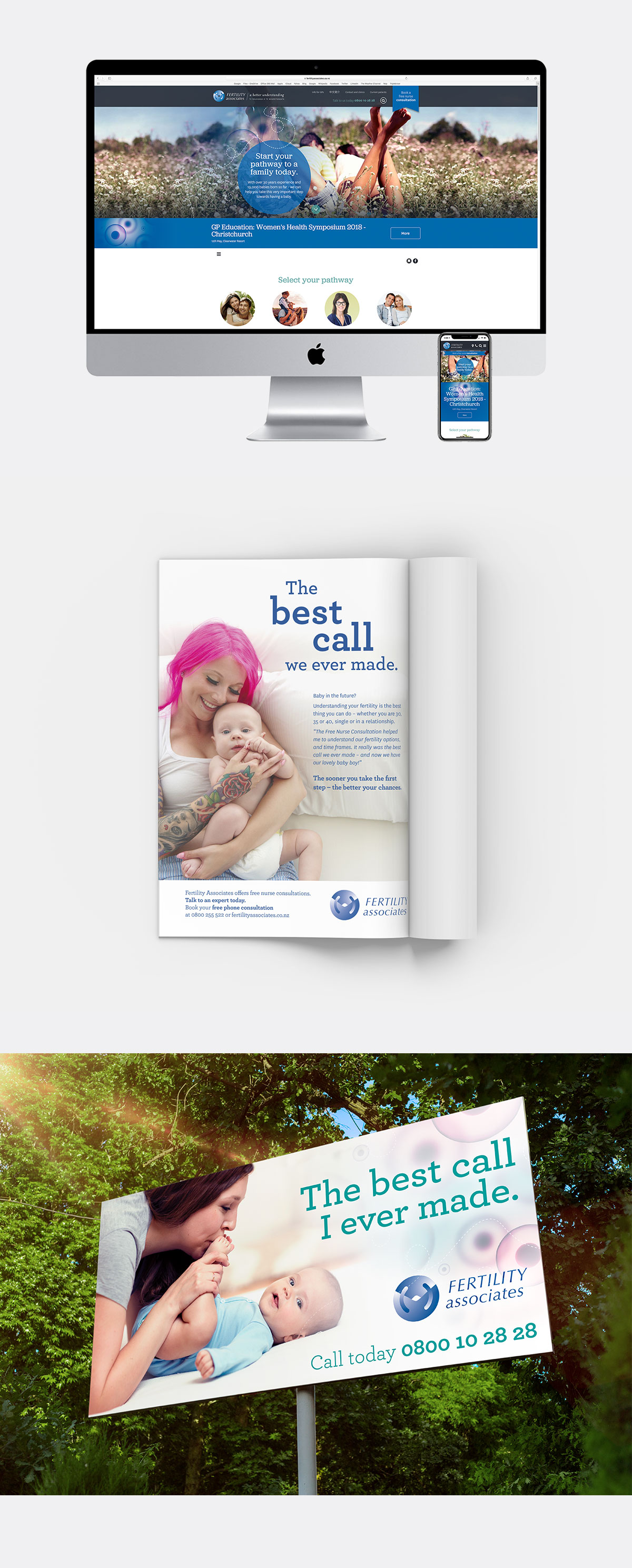
Fertility Associates deals with an incredibly diverse array of people with many differing needs every day. Trying to cater for such a broad spectrum, their website had grown in size and density, and inevitably lacked clarity. Due to the sensitive nature of fertility, websites were often the first step. Fertility Associates needed a new site and they knew it had to look great, be empathetic and understanding, plus get across complex facts, figures, and detailed medical explanations. But how could it be relevant to them all without drowning everybody in information overload?
We stepped back and approached this from a user’s perspective. From here, we designed and created a website that that filtered the site’s information from the very beginning. Visitors are asked to select which group they belong to, and relevant pages are shown based on that decision. There’s a wealth of helpful information on the Fertility Associates website – and now that first step is uncluttered, relevant, clear and positive.
Services
- Digital strategy
- Content strategy
- Information architecture
- Wireframes
- Design & Layout
- Content development
- Digital production
- Analysis and refinement
Channels
- Website
- Social

